Dungeon Party.
A multiplayer dungeon crawler built for the Carleton University IMD Capstone Project. I designed and tested the in-game interface, drew the characters that were 3D-modelled into the build, mocked up the world, and made the brand it launched under.
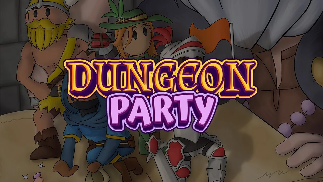
The launch trailer.
Visit the websiteOne world, from the character you pick to the world you travel.
Dungeon Party is a multiplayer dungeon crawler built by a capstone team at Carleton. I worked across the parts a player actually sees: the interface that carries the game's state, the characters and enemies they meet, the maps they move through, and the identity the whole thing shipped under.
The interface was the hardest of those. A dungeon crawler gives you no room to explain anything. The map, the timer, the inventory and the pause state all have to be readable at a glance, mid-fight, with no onboarding. I built those components in Figma and Procreate, then tested several layouts against each other so the final choices rested on something other than preference.
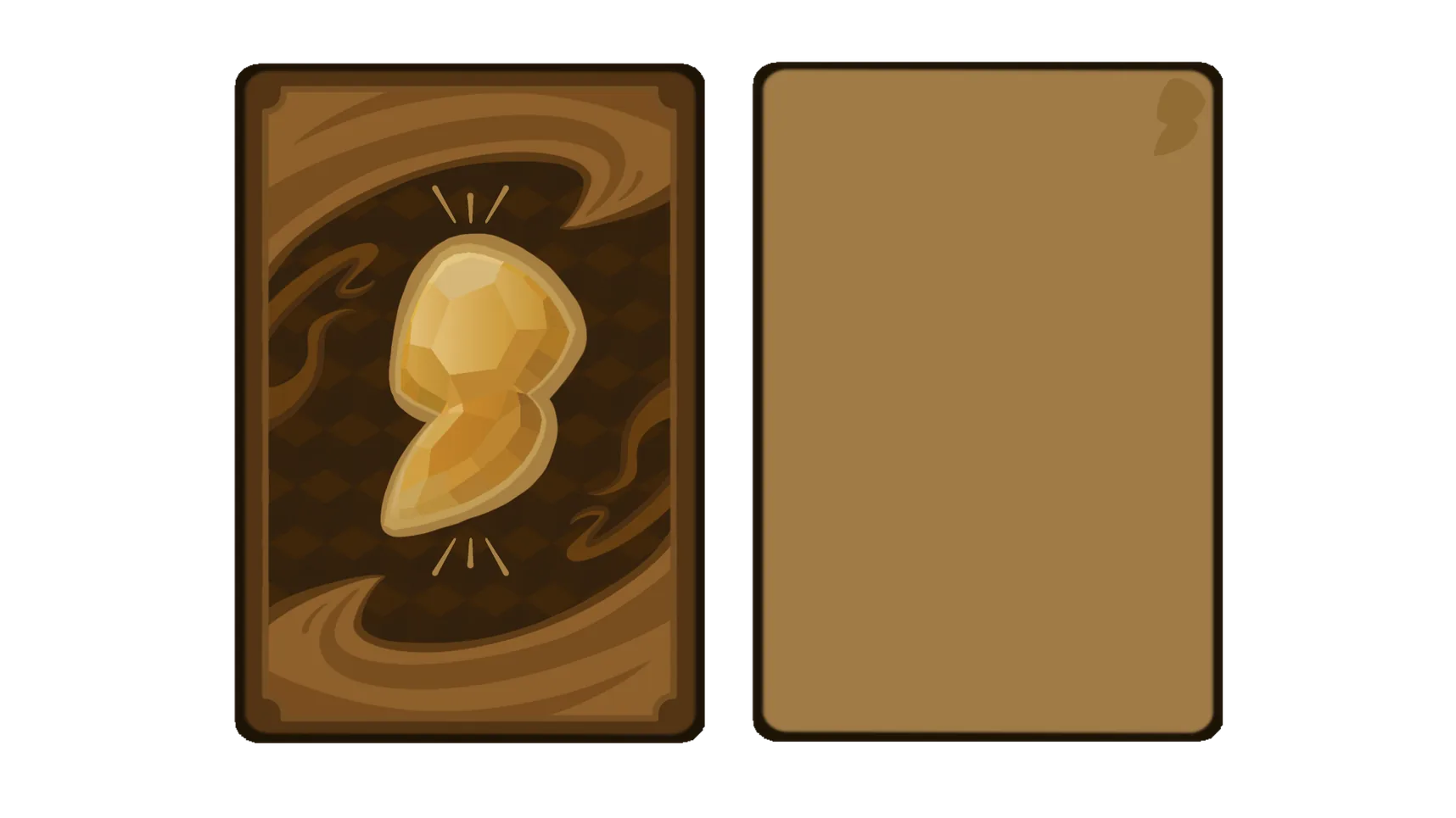
The components that carry the game's state: who is playing and how each of them is doing, the cards that represent items in hand, and the panel every menu is built on.
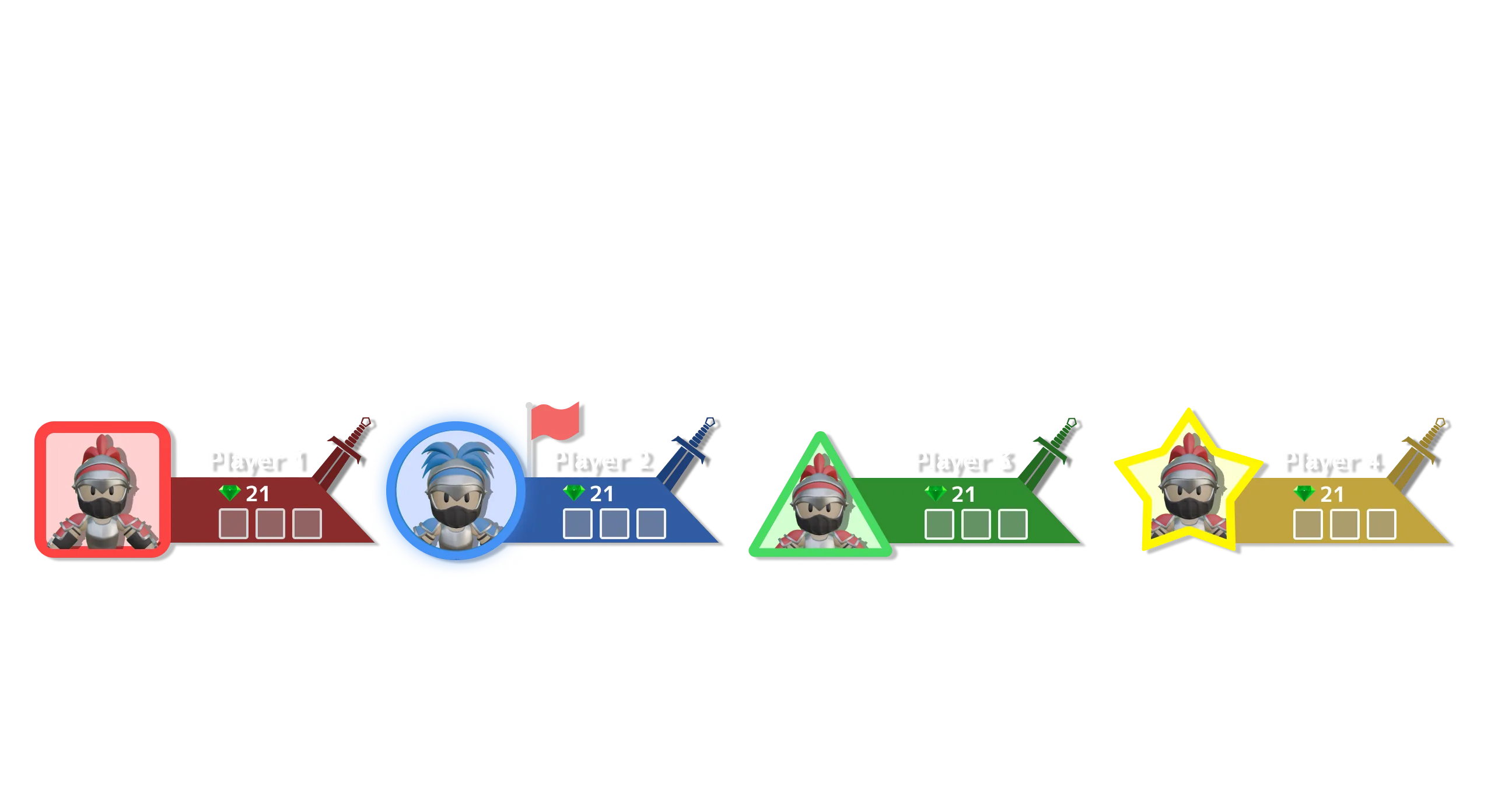
Several layouts were built and compared before this one. It is what we shipped for the dungeon exploration segments: the turn timer sits top-centre where it reads without covering the room, the playfield stays clear, and the player rail runs along the bottom edge so four people can each find their own state at a glance.
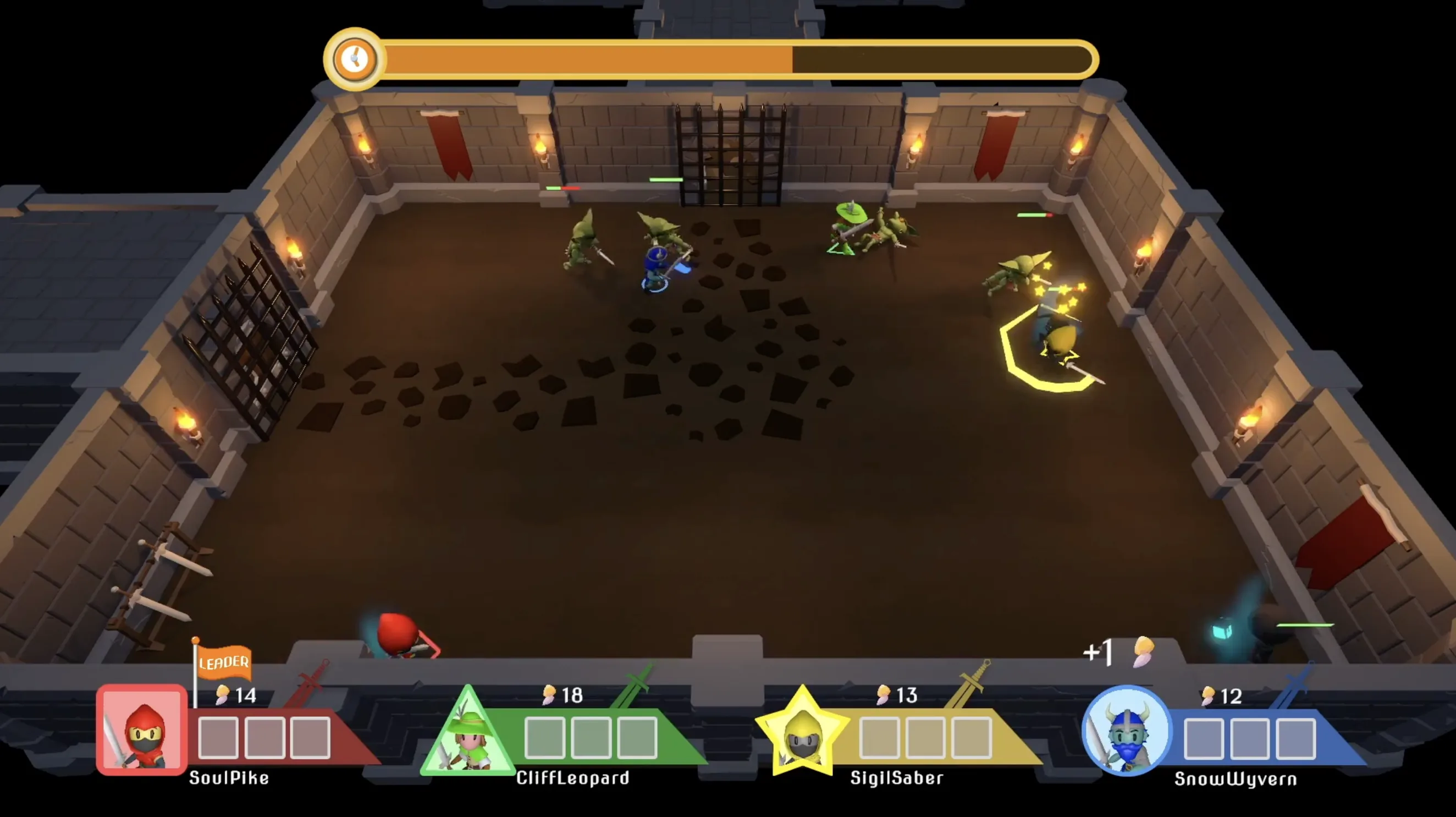
We ran moderated playtests with four players at a time and observers taking live notes, then triaged the findings as a team. Two of them changed the interface directly.
The portal to the boss room showed a bare number counting the rooms still to clear. Nobody read it the way we intended: some players took it for a score, others for a timer. It became a gauge that fills as rooms are cleared.
Players also spent long stretches lost, circling the dungeon hunting for that portal. That became a map the party leader could open. In the next session a player pulled it up unprompted to explain to the others where they were headed, which is the clearest sign a fix has landed.
One finding I did not solve. The HUD was covering a doorway at the bottom of the room, and players kept walking past exits they could not see. It was still happening in the final session.
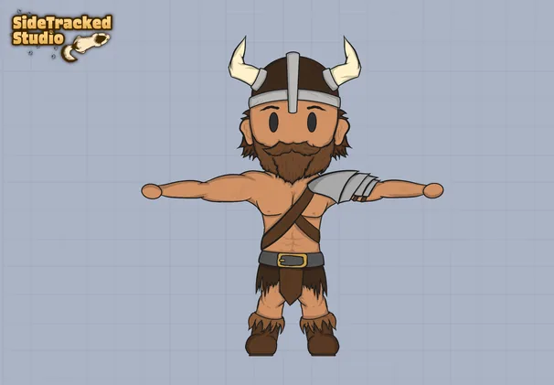
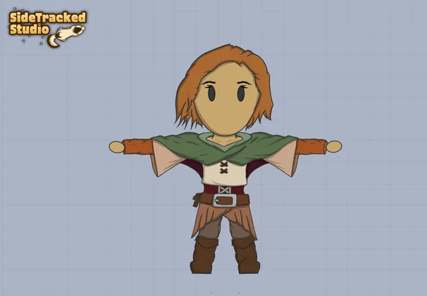
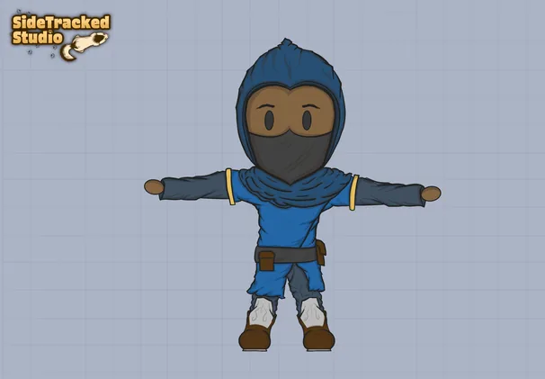
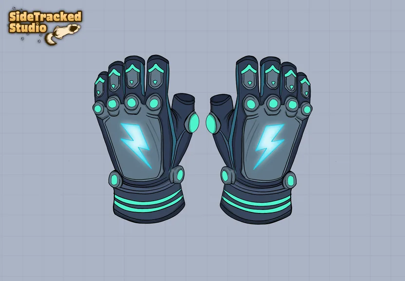
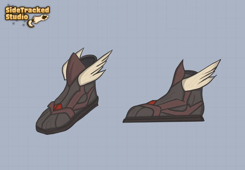
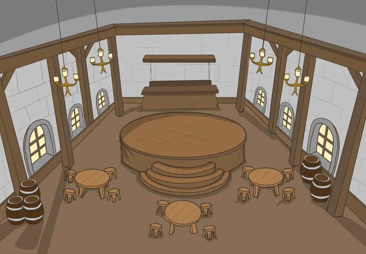
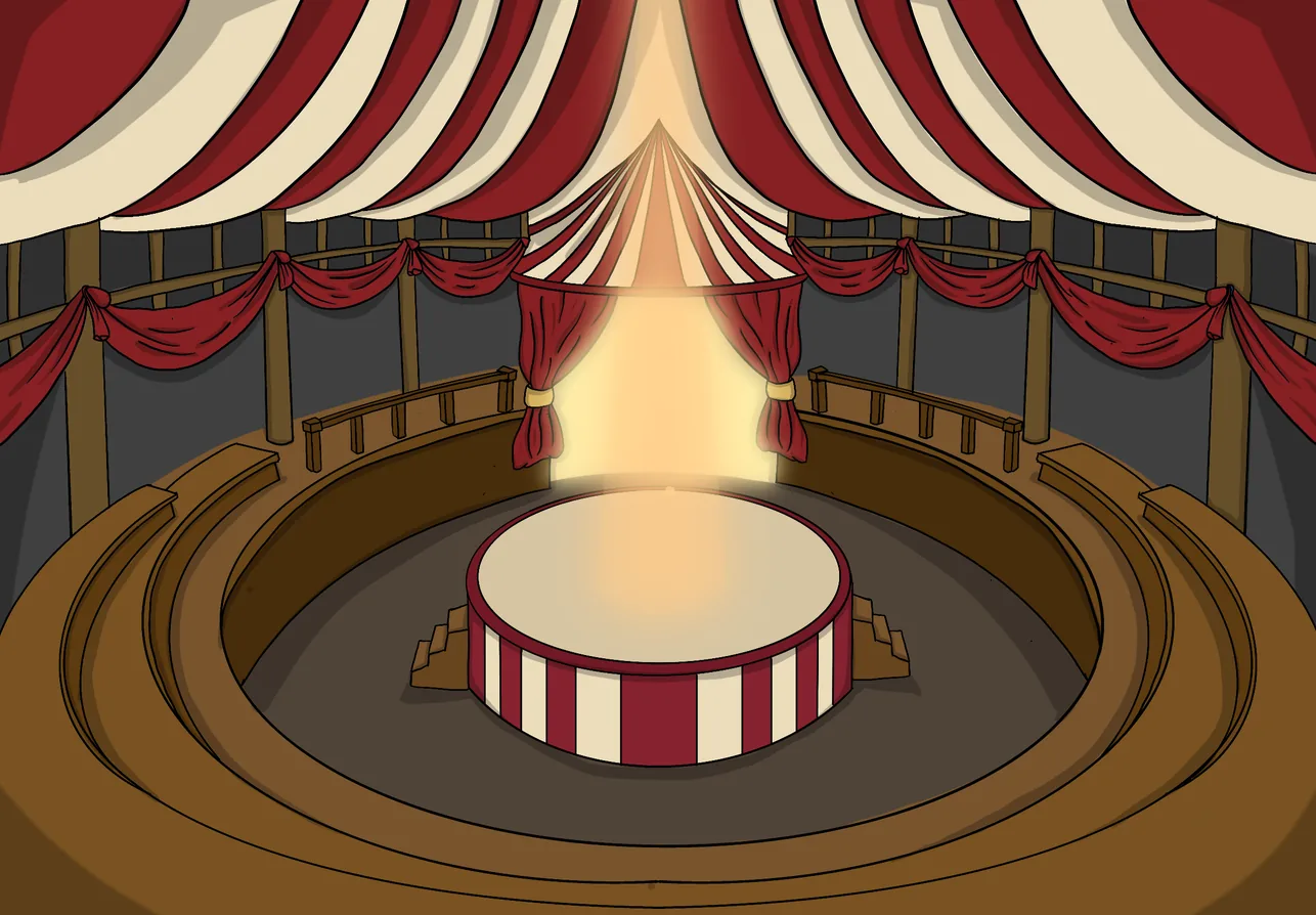
Characters were drawn in Photoshop and Procreate, then 3D-modelled and implemented in the build. Enemies, items and the mini-game maps came out of the same pipeline.
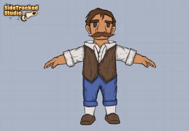
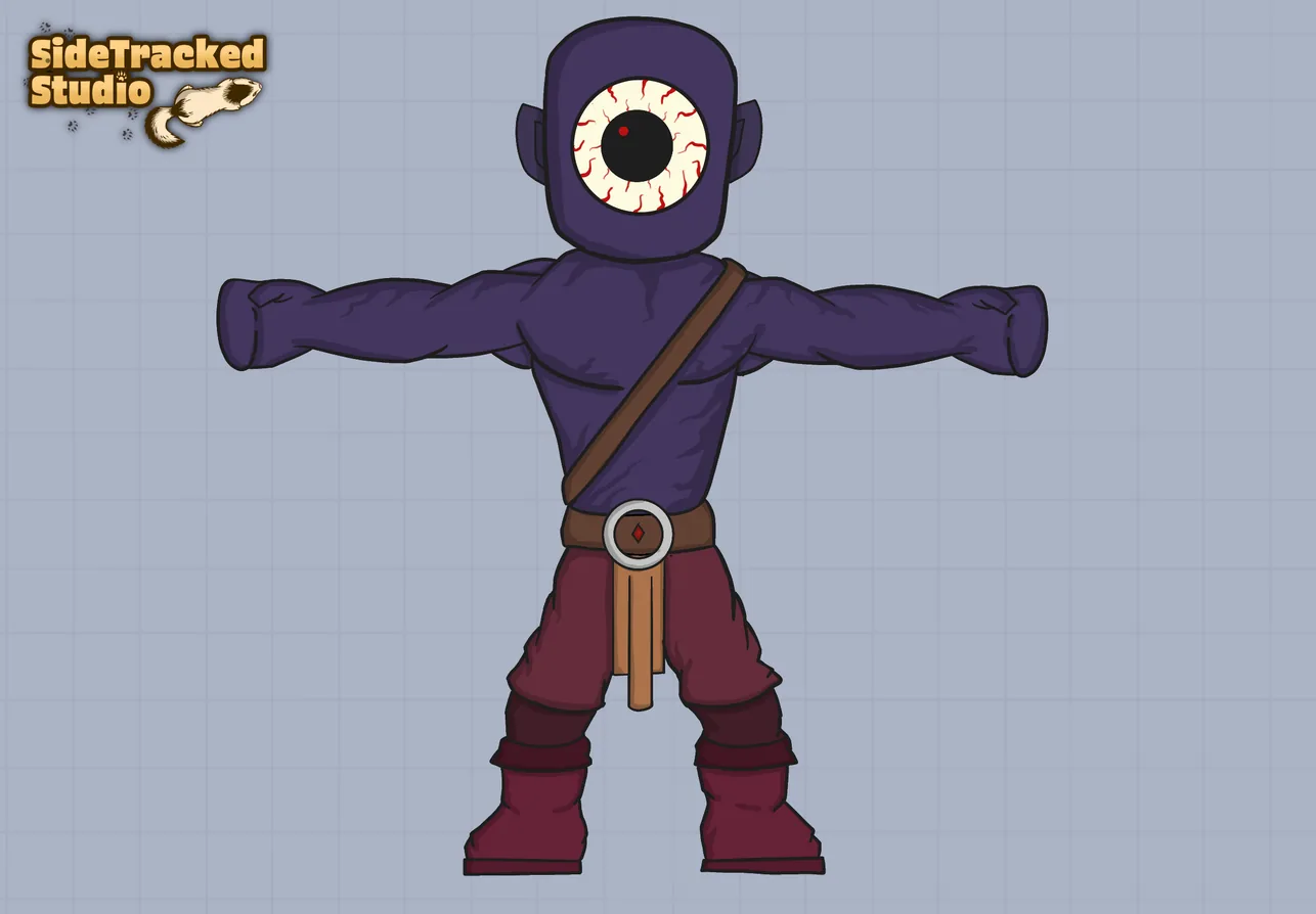
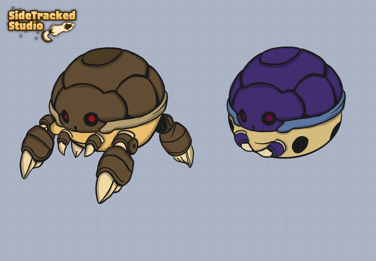
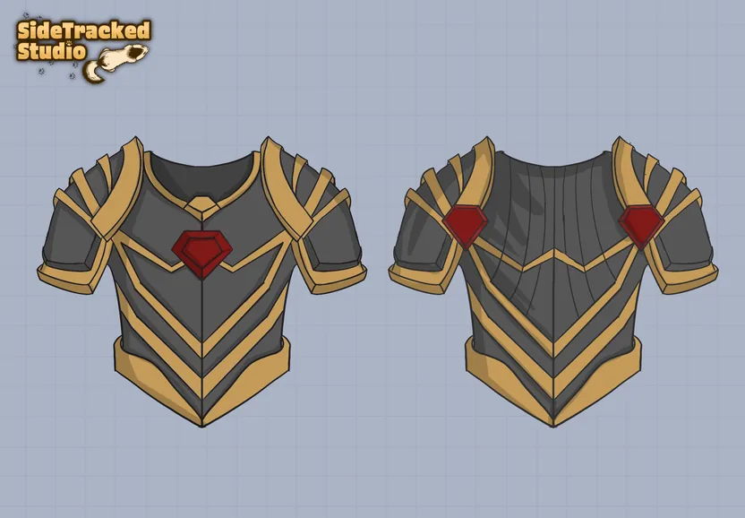
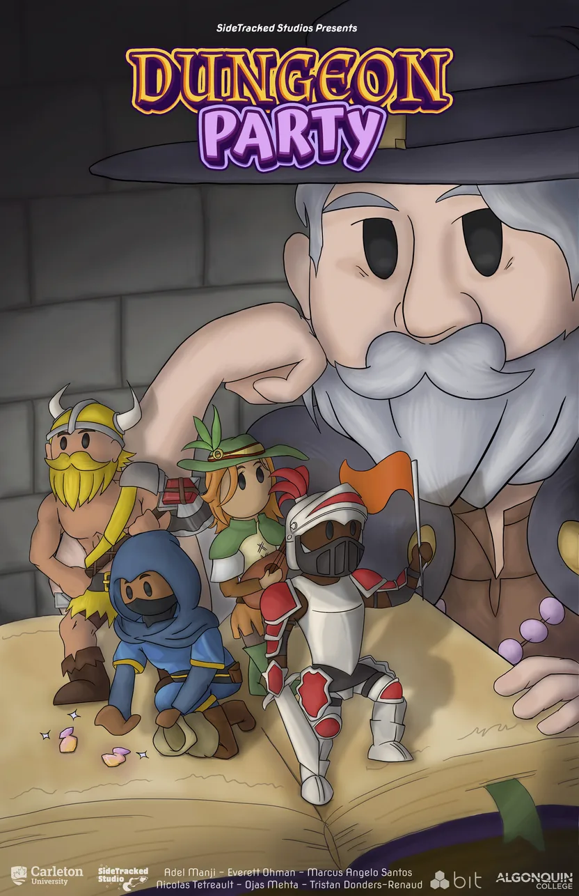
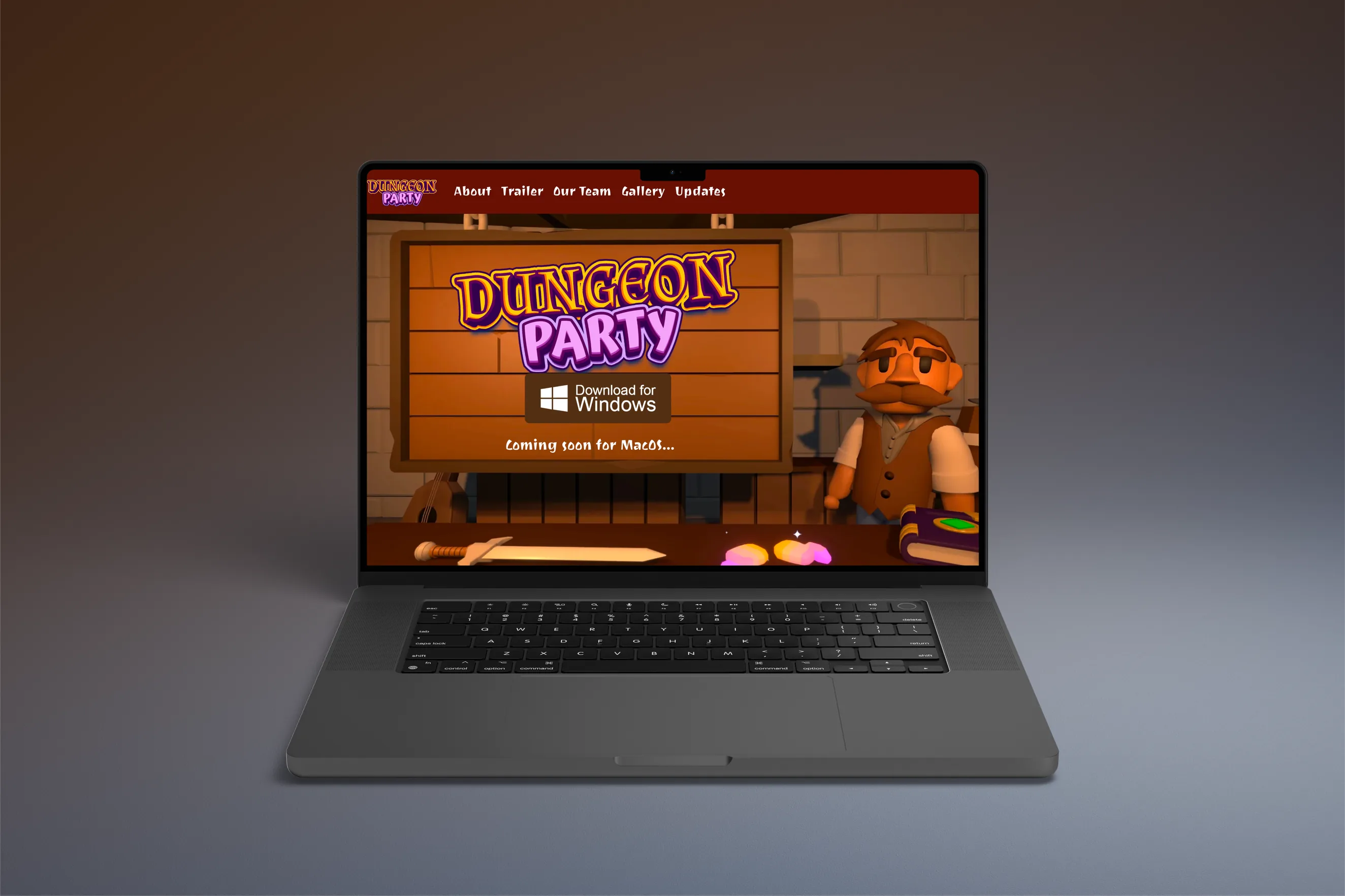
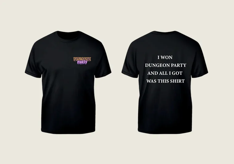
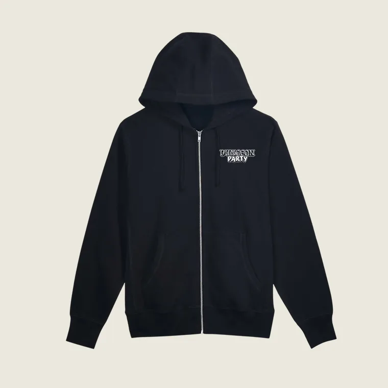
The game shipped with an identity behind it: a logo, a launch poster laid out in InDesign, a website, a trailer, and merch. Zip-ups for the development team, and t-shirts for the Carleton IMD capstone fair.
- My role
- UI, concept and brand design. I designed, built and tested the gameplay UI in Figma and Photoshop, drew the character designs for the playable classes, NPCs and enemies, and the level and map concepts in Photoshop and Procreate. I also ran branding and marketing: the logo, the launch poster, the merch for the capstone fair (shirts, hoodies and stickers), and the trailer and website the game was promoted with.
- The hardest call
- Splitting my time across four disciplines. The project ran eight months alongside a full university course load, with UI, characters, world and brand all needing attention at once. It was less a single design decision than a sustained test of whether I could move between technical skill sets fast enough to keep a fixed deadline in sight.
- In hindsight
- The integration of the UI into the build. The team was split between designers and developers, and the interface elements ended up appearing on screen more abruptly than I wanted. Given the time again I would work more directly with the developers on how each element enters and leaves, so the animation and timing were designed rather than inherited.