Behr Capital.
A site for an investment advisory firm that introduces clients to licensed professionals instead of selling them products. Built to make an unfamiliar fee model understood, and to let people run their own numbers before they ever book a call.

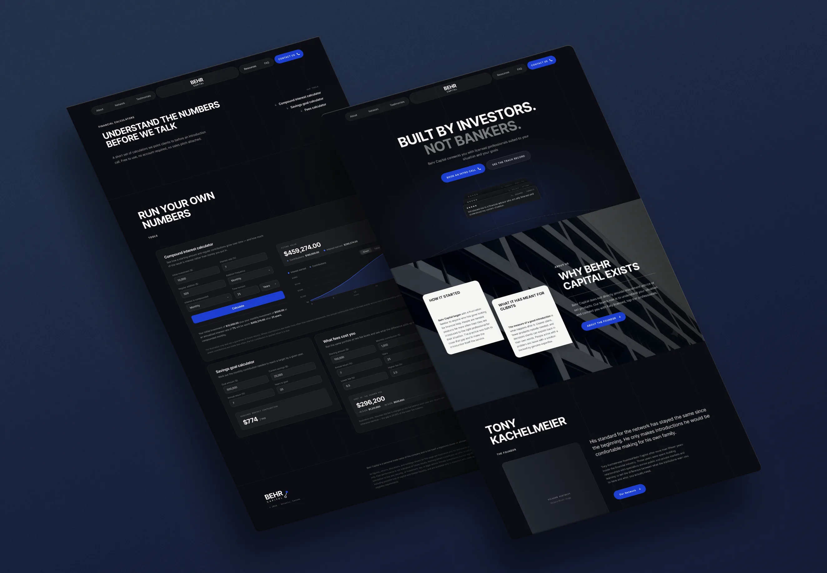
The home page: the positioning stated first, with a client proof point directly beneath it.
Open the prototypeEarn the call before you ask for it.
Behr Capital does not sell products. It introduces clients to licensed professionals across public and private markets, mortgages, tax, legal and accounting, and takes no direct client fees. That model is unusual enough that the site's first job is making it understood before it can be trusted.
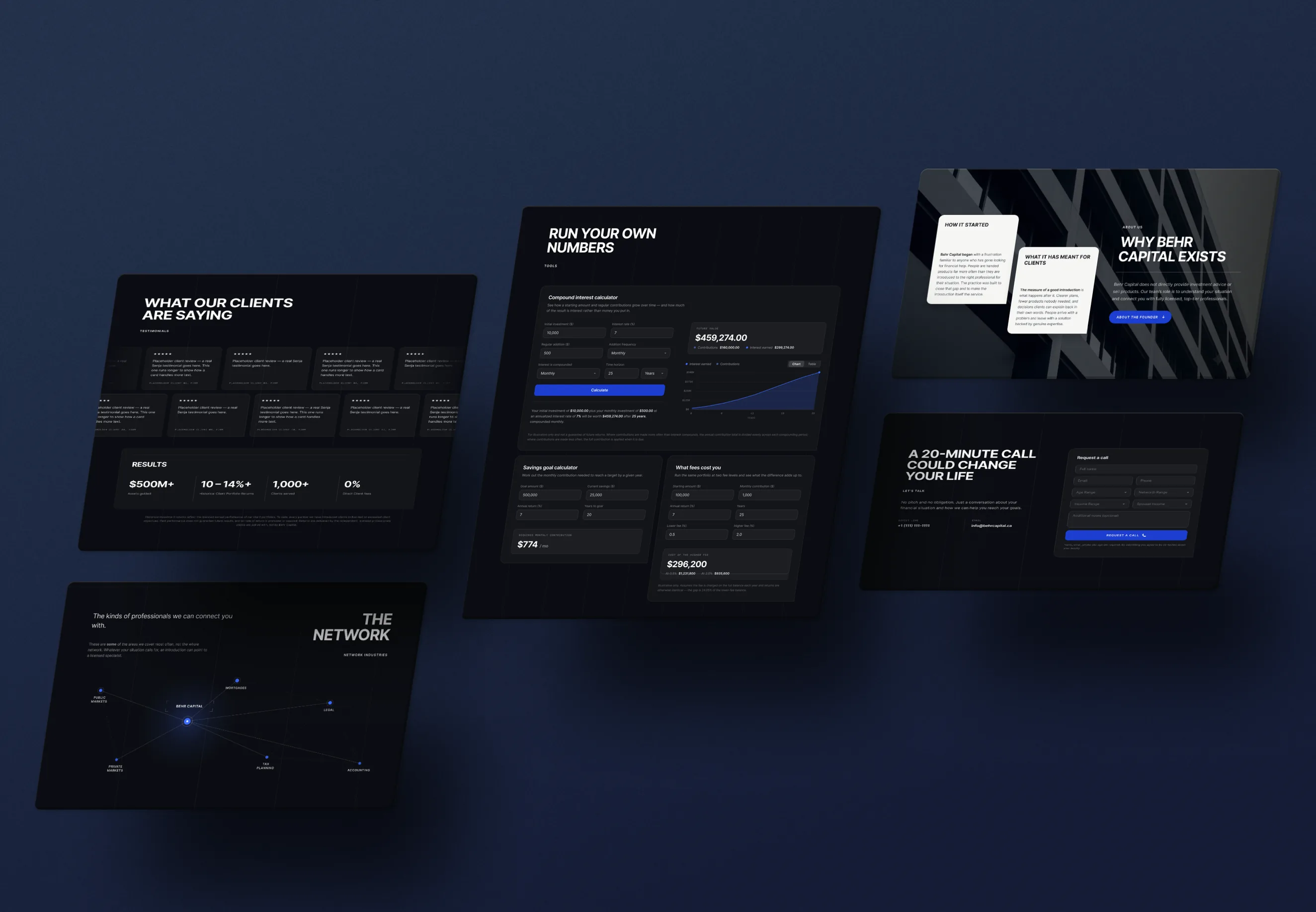
So the page is ordered as an argument rather than a brochure: why the firm exists, the founder behind it, the network drawn as an actual diagram, then the track record. Only after all of that does it ask for anything, and even then it offers a set of calculators first, so a visitor can model compound interest, a savings goal, or what fees are quietly costing them without speaking to a single person.
- The brief
- The client's asks came with a constraint that shaped everything else: the site is planned to grow, with new resources and sections added over time, so the design had to stay cohesive across pages while leaving room to extend later. They also needed it to comply with specific financial-services policies, which set limits on what the site could claim and how. So the work was less about designing a page than about building a system that would still hold together once other people added to it.
- What I decided, and why
- The calculators come before the contact form. Finance asks people to hand over personal information, and nobody does that for a firm they do not already trust, so the site had to give something before it asked for anything. Three calculators let a visitor model compound interest, a savings goal, or what fees are quietly costing them, and then leave without speaking to anyone. I wrote those as React code components inside Framer rather than dropping in a third-party widget, so the maths meets Ontario's financial standards and a visitor gets correct figures without being sent elsewhere to find them. Ranking those resources high also says something about the firm: that it would rather inform than capture. The network diagram does the same job a different way, drawing the referral model as a picture instead of explaining it in copy, so a visitor can see how the business actually works before deciding to engage with it.
- Where it landed
- Still in progress. The design is settled and the site is being built in Framer with the calculators already coded, but nothing is live yet so there are no numbers to report. The first thing I will watch is whether people use the calculators before booking a call, because the whole structure rests on the idea that giving something away earns the enquiry.