Shakepayments.
A personal design challenge. With stablecoins increasingly being spent in everyday commerce, I wanted to design an app built around a credit card you can pay off in crypto. A Visa card, an activity feed that reports what each purchase earned back, and spending controls a tap away.
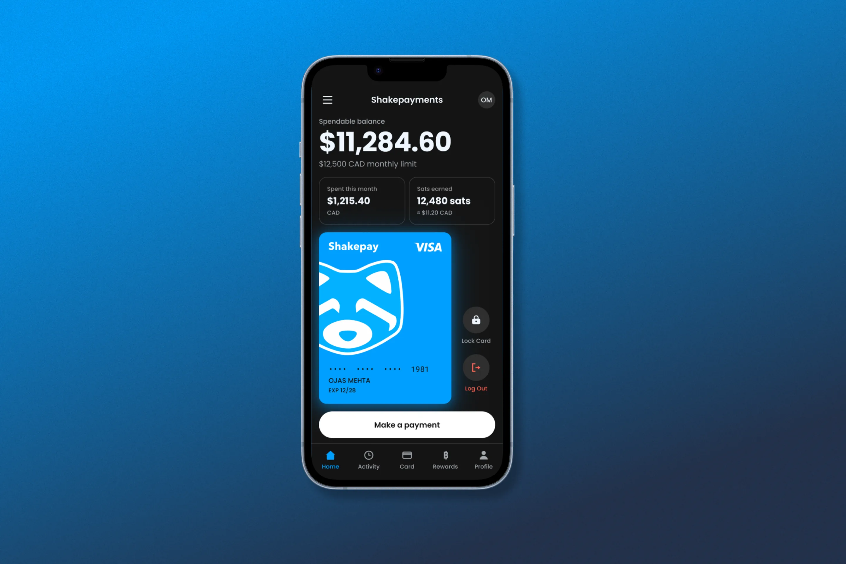
The home screen: one spendable balance, the card, and a single primary action.
Open the prototypeSpending crypto should feel as ordinary as tapping a card.
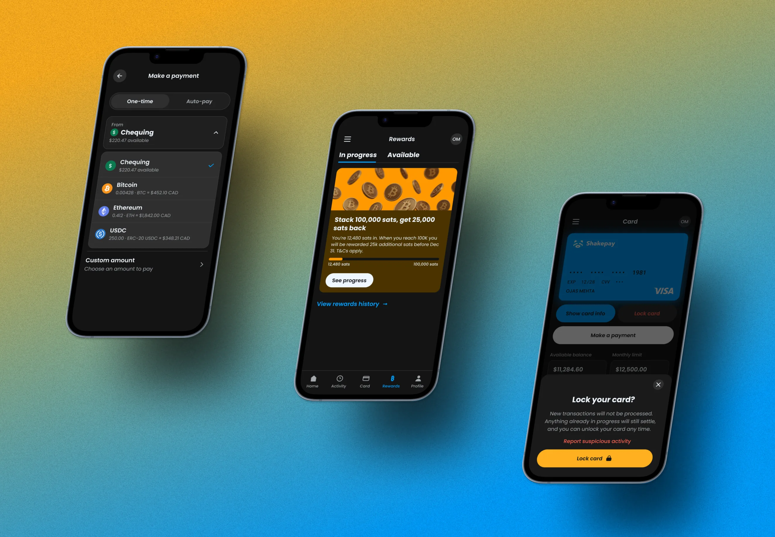
Stablecoins are increasingly spent like ordinary money, but settling a card balance with them still sits outside what most banking apps will do. So I set myself the problem: a credit card you pay off in crypto, that feels unremarkable to use. The card draws from a chequing balance or from bitcoin, ethereum and USDC, and earns sats back on everything.
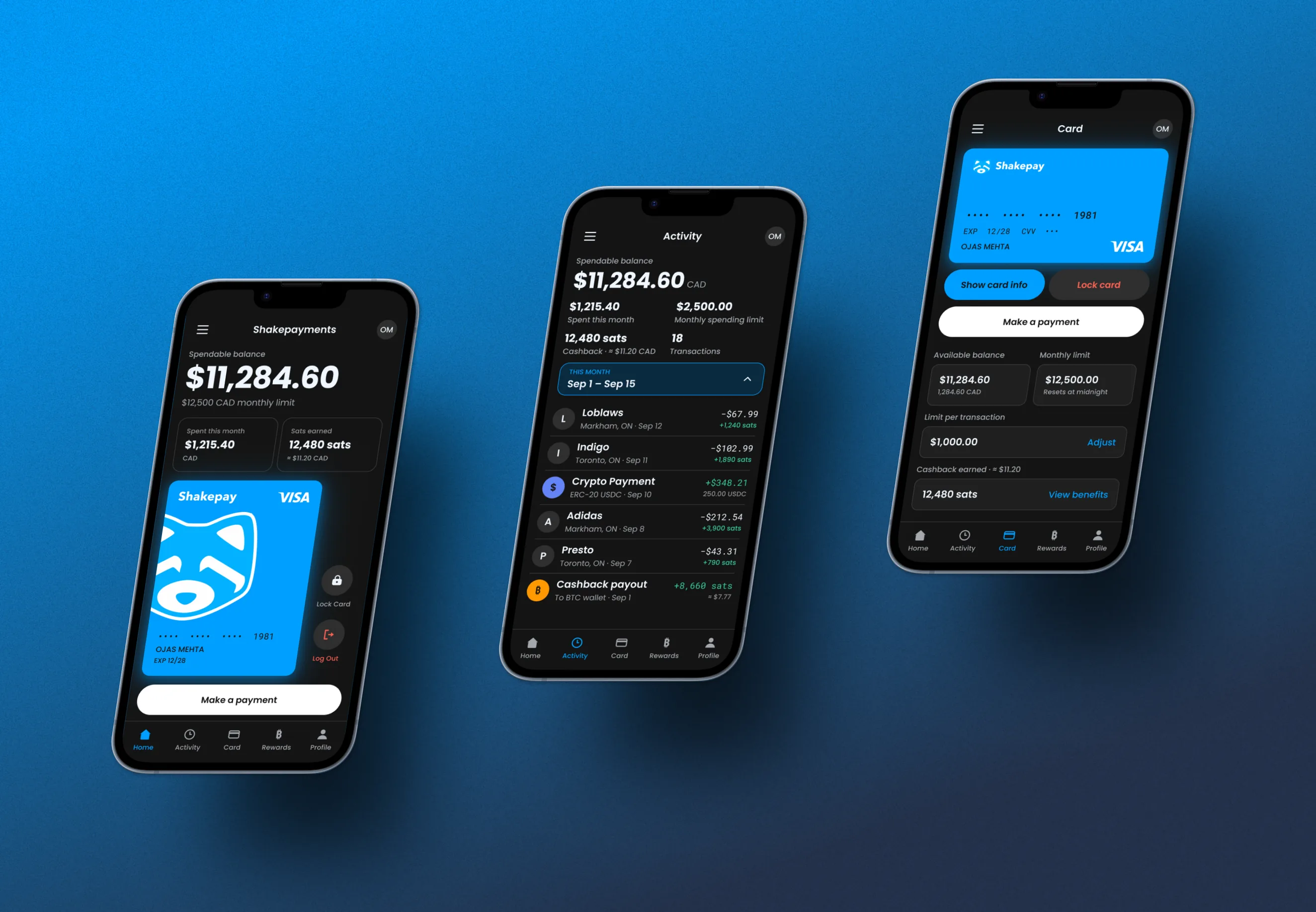
The hard part was never the crypto. It was making a product with four funding sources and a rewards programme still read as a normal payments app. So one balance stays in front of the user at all times, and complexity surfaces only where it is needed: a payment sheet showing what each source is worth in CAD before you commit, an activity feed reporting sats earned per transaction, and a card screen where locking the card is one tap and reversible.
- The brief
- I set the brief myself. With no client and no stakeholder deciding what to change or which way to take the project, I studied Wealthsimple, Coinbase, TD and KOHO, then chose which of their conventions to keep and which to drop. The rewards tab owes a lot to Wealthsimple's. The rewards were also the hard part: sats cashback only means anything to someone who already holds bitcoin, so most of the thinking went into how it should behave and how to show it without the number being meaningless.
- What I decided, and why
- Home shows one spendable balance, not a breakdown of chequing, bitcoin, ethereum and USDC. The main Shakepay app already shows people their crypto balances, and not everyone using Shakepay would have the card, so I treated this as a companion app rather than a second wallet. That meant the home screen should do what a banking or credit card app does and lead with what you can actually spend.
- Where it landed
- High-fidelity screens, a clickable prototype and a small design system behind them. It never went in front of real users. The first thing I would test is onboarding, because the premise is the risky part: someone opening this has to understand it is an app for Shakepay's credit card rather than another crypto wallet, and that paying the balance off from a crypto wallet alongside a normal chequing account is the thing that makes it different from a bank. If that does not land in the first few seconds, none of the screens after it matter.